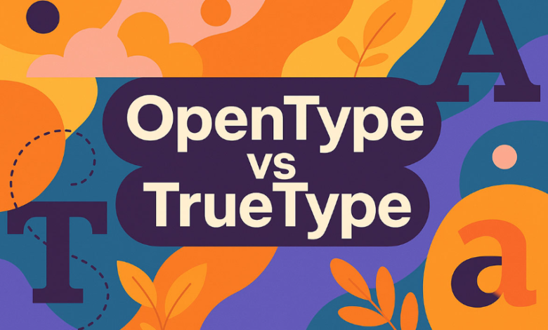
TrueType is a classic font format known for crisp outlines and smooth scaling. Designs built using this format perform well whether in print, on digital screens, or in various display sizes. The format gives precise control over how glyphs render, which is essential when every curve, weight, and counter needs to maintain integrity in different settings. Because of its reliability, many foundries offer TrueType versions of their typeface families to ensure compatibility and consistency.
TypeType’s TrueType Collection: What Makes It Special
TypeType offers a dedicated collection of truetype fonts with modern design, carefully shaped symbols, and elegant letterforms. The collection spans numerous styles including serif, sans serif, slab serif, display, and script. Designers can explore every font family, test trial versions, and acquire commercial licenses. Every font in the TrueType collection is technically verified and intended to perform flawlessly across all kinds of projects.
TrueType fonts from TypeType come with tags and attributes that make them easy to find based on needs—tags like clean, minimal, formal, modern, or display are used to filter through styles. The trial-version policy means designers can try the fonts in mockups or prototypes before committing. When using any font from the collection, one can expect strong multilingual coverage and well-designed symbols to support a wide range of design tasks.
See also: What Makes a Bluetooth Projector Ideal for Home Theaters?
Key Attributes of Quality TrueType Fonts
Clean Rendering and Smooth Scaling
TrueType fonts are vector-based, which means they scale without losing sharpness. Whether small body text or large display headlines, the letters stay sharp. This is particularly important for print materials where fine details can get lost, and for digital displays of various resolutions where aliasing or distortion could otherwise degrade the look.
Variety in Style and Genre
Because the TrueType collection includes serif, sans serif, slab, display, and script fonts, designers have access to diverse typographic voices under one roof. Whether a project demands something formal, ornate, quirky, or restrained, there is a font that matches. Also, filtering by style tags lets designers narrow down quickly to fonts that match mood, tone, or function.
Technical Reliability and Licensing
TypeType ensures trial versions of their TrueType fonts are available. Designers can test layout, spacing, kerning, multilingual glyph sets, symbols, and special characters. Licensing is clearly stated for commercial use, which helps avoid legal uncertainties. Every font is meant to be used under professional conditions, including print, web, display, and other media.
How TrueType Fonts Create Advantage in Real Projects
Professional Brand Identity and Consistency
A well-chosen TrueType font contributes to brand consistency. Since these fonts render crisply across media, a company’s materials—logos, print, digital, packaging—all maintain a unified typographic voice. That consistency helps build trust and recognition.
Legibility at All Sizes
In many design applications—from small footnotes or captions to large headers or signage—clarity and readability are non-negotiable. TrueType’s precise outlines and hinting ensure that at smaller sizes letters remain legible, and at large sizes details do not distort. This makes the format trustworthy for use in anything from UI design to billboard printing.
Flexibility Across Uses
Because the TrueType collection offers many styles and genres, designers can pick a font for display purposes, then use matching weights or styles of the same family for body text or subordinate elements. This reduces mismatched typographic combinations and simplifies design systems. The trial feature helps test these combinations before finalization.
Practical Tips for Using TrueType Fonts Wisely
Choose Fonts According to Context and Mood
Match the design style (serif, sans serif, display etc.) to the tone of your project. A legal document or academic publication will benefit from a more restrained serif or sans serif; a creative headline or poster might shine with a script or display variant. Always align the font’s personality with the message.
Test in Real-World Conditions
Use trial fonts in your layouts—print proofs, digital mockups, mobile views—to ensure spacing, kerning, margins, and readability are all working. Also test multilingual characters or symbols if you need support beyond one language or special glyphs.
Maintain Hierarchy
Use different weights or styles within the same font family for headings, subheadings, body text, or captions. Keep contrast clear so that titles stand out but smaller text remains readable. Avoid combining too many different font families that might clash.
Conclusion
TrueType fonts offer designers precision, reliability, and versatility. A well-designed TrueType collection delivers clean rendering, a broad range of styles, robust technical quality, and clear licensing. In many projects—from branding and print media to digital displays—choosing strong TrueType fonts can improve clarity, professionalism, and overall aesthetic impact. When the details are sharp and the style consistent, audiences notice and design integrity extends across every application.